

Why White Walls Can Be Challenging for People with Autism and Sensory Sensitivities
White has long been associated with cleanliness, simplicity, and brightness. In interior design, white walls are often used to make spaces feel larger and to reflect as much light as possible. However, for some people with autism and other sensory processing differences, an abundance of bright white surfaces can create an environment that feels uncomfortable rather than calming.
The reason lies partly in how white interacts with light. White surfaces reflect a high proportion of the light that falls on them, increasing the overall brightness of a room. While this can make a space appear fresh and airy, it can also contribute to visual overstimulation for individuals who are particularly sensitive to light and contrast.
Many autistic people experience heightened sensory perception, which can make bright, highly reflective environments feel overwhelming. Large expanses of stark white walls, ceilings, and furnishings can produce glare, create harsh visual contrasts, and lead to feelings of discomfort, fatigue, or difficulty concentrating. The effect may be especially noticeable in rooms with significant natural daylight or bright artificial lighting.
This does not mean white should never be used in a sensory-friendly home. Instead, interior designers often consider softer alternatives such as warm whites, muted neutrals, gentle greys, or nature-inspired tones. These colours can still provide a sense of lightness and openness while reducing the intensity that pure white may create.
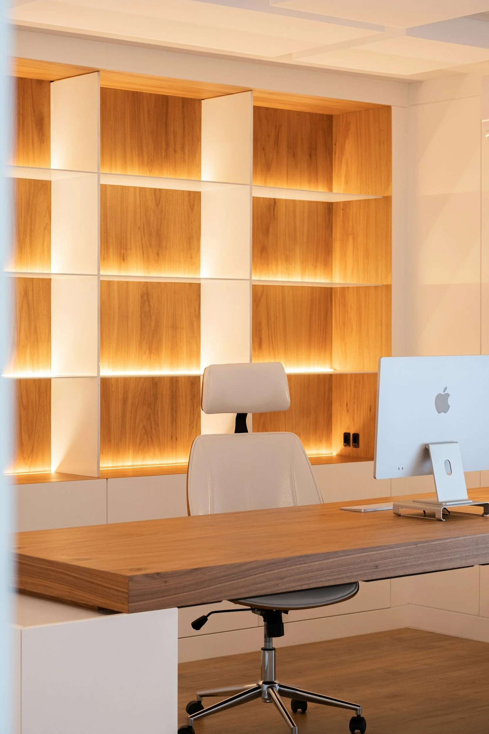
Texture and lighting also play an important role. Layered lighting, matte finishes, natural materials, and softer colour palettes can help create a more balanced environment that supports comfort and wellbeing. The goal is not simply to make a room look beautiful, but to ensure it feels comfortable for the people living in it.
